Pure CSS Custom Error Messaging for Default Form Elements

This tutorial will show you how to create and customize error messaging for various form elements. In this tutorial, we will customize everything from a basic error message to input field errors and tooltips. The best part? We will be using only CSS for customizations – that means no images or javascript required!

HTML

Below is the markup for the form elements we will be creating error messaging for. This is all of the HTML used throughout this tutorial. Copy and paste this code into your working file:

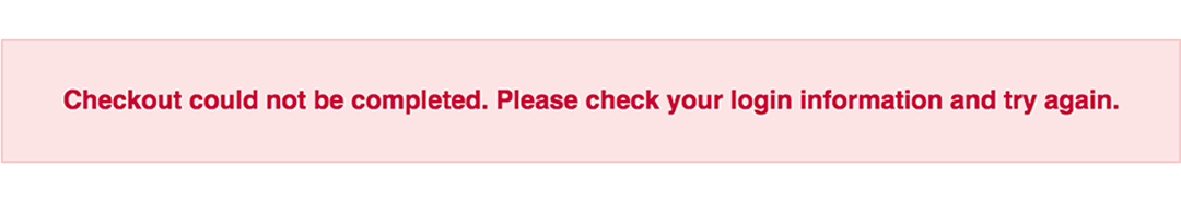
<!-- Basic Error Message -->
<div class="error-message">
  <span class="error-text">Checkout could not be completed. Please check your login information and try again.</span>
</div>
 
<!-- Input Field Error -->
<div class="input-group error">
  <label>Password *</label> 
  <input type="text">
  <div class="error-message">Password is a required field.</div>
</div>
 
<!-- Input Field Error with Tooltip -->
<div class="input-group error">
  <label>Quantity</label> 
  <input type="text">
  <div class="error-tip">Enter a quantity</div>
</div>

CSS

Now onto my personal favorite: the CSS. We will keep the basic functionality of the form elements but completely customize their appearance. In the end, they will stand on their own as custom design elements that thoughtfully guide the user through the form process, making it as straightforward and painless as possible.

Basic Error Message

Let’s start with a basic error message. We are going to customize the HTML above to look like this:

This is what we start out with, by default, after adding the HTML:

basic error message default

Customizing a basic error message is really simple. All we have to do is give our text a colored background and a couple font styles using CSS. To style the error message background, add the following styles to your CSS stylesheet:

.error-message {
  background-color: #fce4e4;
  border: 1px solid #fcc2c3;
  float: left;
  padding: 20px 30px;
}

Now let’s style the text itself by adding the following font styles:

.error-text {
  color: #cc0033;
  font-family: Helvetica, Arial, sans-serif;
  font-size: 13px;
  font-weight: bold;
  line-height: 20px;
  text-shadow: 1px 1px rgba(250,250,250,.3);
}

That’s it! Keep reading to learn how to style input field and tooltip errors.

(more…)

FacebookTwitterPinterest

Read More

Pure CSS Custom UI Elements Part 1 – Customizing Default Form Elements

This tutorial will teach you how to customize the default UI of some of the most basic form elements using CSS. Specifically, we will customize the default radio buttons, checkboxes, select (aka dropdown) lists, and buttons in Chrome, Safari, Firefox, and Internet Explorer.

With CSS3 we have the ability to customize the appearance of almost any element we want. That’s awesome! Why? Because that means you don’t need to know (or, more importantly, use) any JavaScript. Now all this customization may sound daunting, and granted it does take a few extra steps to get these beautiful customizations actually looking beautiful in all major browsers, but do not be intimidated! The end result is well worth the effort.

HTML

First things first, we need to add the markup for the elements that make up our form. This is all of the HTML we will need. Copy and paste this code into your working file:

<!-- Radio Buttons - using images -->
<div>
  <input id="male" type="radio" name="gender" value="male">
  <label for="male">Male</label>
  <input id="female" type="radio" name="gender" value="female">
  <label for="female">Female</label>
</div>
 
<!-- Checkboxes - using images -->
<div>
  <input id="check1" type="checkbox" name="check" value="check1">
  <label for="check1">Checkbox One</label>
  <br>
  <input id="check2" type="checkbox" name="check" value="check2">
  <label for="check2">Checkbox Two</label>
</div>
 
<!-- Dropdown List - using images -->
<div>
  <select>
    <option value="1">01</option>
    <option value="2">02</option>
    <option value="3">03</option>
  </select>
  <select>
    <option value="2000">2000</option>
    <option value="2001">2001</option>
    <option value="2002">2002</option>
  </select>
</div>
 
<!-- Buttons - no images! -->
<!-- Two-tone Button -->
<div>
  <a href="#">next</a>
  <span class="buttonArrow">&#9656;</span>
</div>
 
<!-- Gradient Button -->
<a href="#" class="grayButton">Cancel</a>

CSS

Next comes the fun part: the styling, the customization, the CSS! We are going to keep the basic functionality of our elements but, with just a few rules, change their entire appearance and better integrate them into our overall design. When we’re done, they will look and feel like a well-thought-out, well-executed design element rather than an afterthought.

Radio Buttons

Let’s start with the radio button. We are going to customize the browser’s default UI to look like the screenshots below:

For reference, this is what we are starting out with, by default, after only adding the HTML:

First, we need to indicate that the radio button and checkbox inputs are clickable by changing their label cursors to pointers. We should also adjust their spacing properties to fit our design. Note: The following styles are shared between both the radio buttons and checkboxes:

/* Shared Label Styles */
label {
  cursor: pointer; /* indicates the element is clickable */
  display: inline-block;
  position: relative;
  padding-left: 0px;
  margin-right: 10px;  /* margin between input types */
}
 
label:before {
  content: "";
  width: 15px;
  height: 15px;
  position: absolute;
  left: 0;
}

Now we hide the input radio type, which hides the browser’s default element and style:

/* Radio Buttons */
input[type=radio] {
  display: none;  /* hides the default input element */
}

Next, to achieve the circle effect of the radio button, we must adjust its border-radius to half of its height and width. We also need to link our custom unselected (or empty) image by replacing its URL with the background-images’s default one below:

.radio label:before {
  border-radius: 8px;	
  background: url(your_unselected_image.png) left center no-repeat;
}

Lastly, we must link our custom selected (or checked) image to our “checked” radio input:

input[type=radio]:checked + label:before {
  background: url(your_selected_image.png) left center no-repeat;
}

Keep reading to learn how to style checkboxes, dropdown lists, and buttons.

(more…)

FacebookTwitterPinterest

Read More