your market – top img
Your Market
The Oklahoma based supermarket “Homeland” was in need of a major design overhaul, including a new name, brand and environmental graphics. The new brand needed to reflect the supermarket’s interest in local inventory and employee-owned business while still relating to the widest audience base possible.
Solution
The first step was to rename the store to “Your Market.” This new title creates a sense of ownership and brand loyalty for the customer, making their overall experience more enjoyable and increasing their likelihood of returning. The logo and symbol are also extremely flexible and easily adaptable to any situation or need. The symbol continues the engaging nature of the brand and establishment as it is intended to be read as “yum” along with abbreviating “your market.”
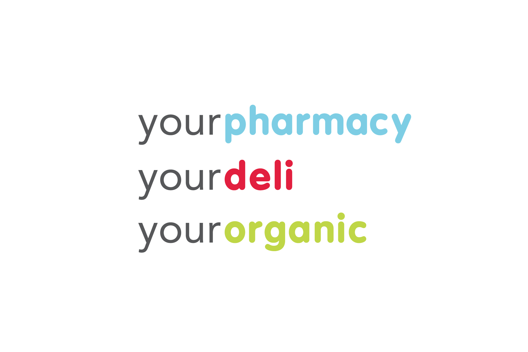
The lively color palette and playful type treatment create a unique personality for the store and bring it’s brand up to date. The dedicated color system creatively categorizes different departments within the market, while still remaining flexible to changes. This helps create a common sense of order for the customer and allows them to easily understand the store’s functions and layout.
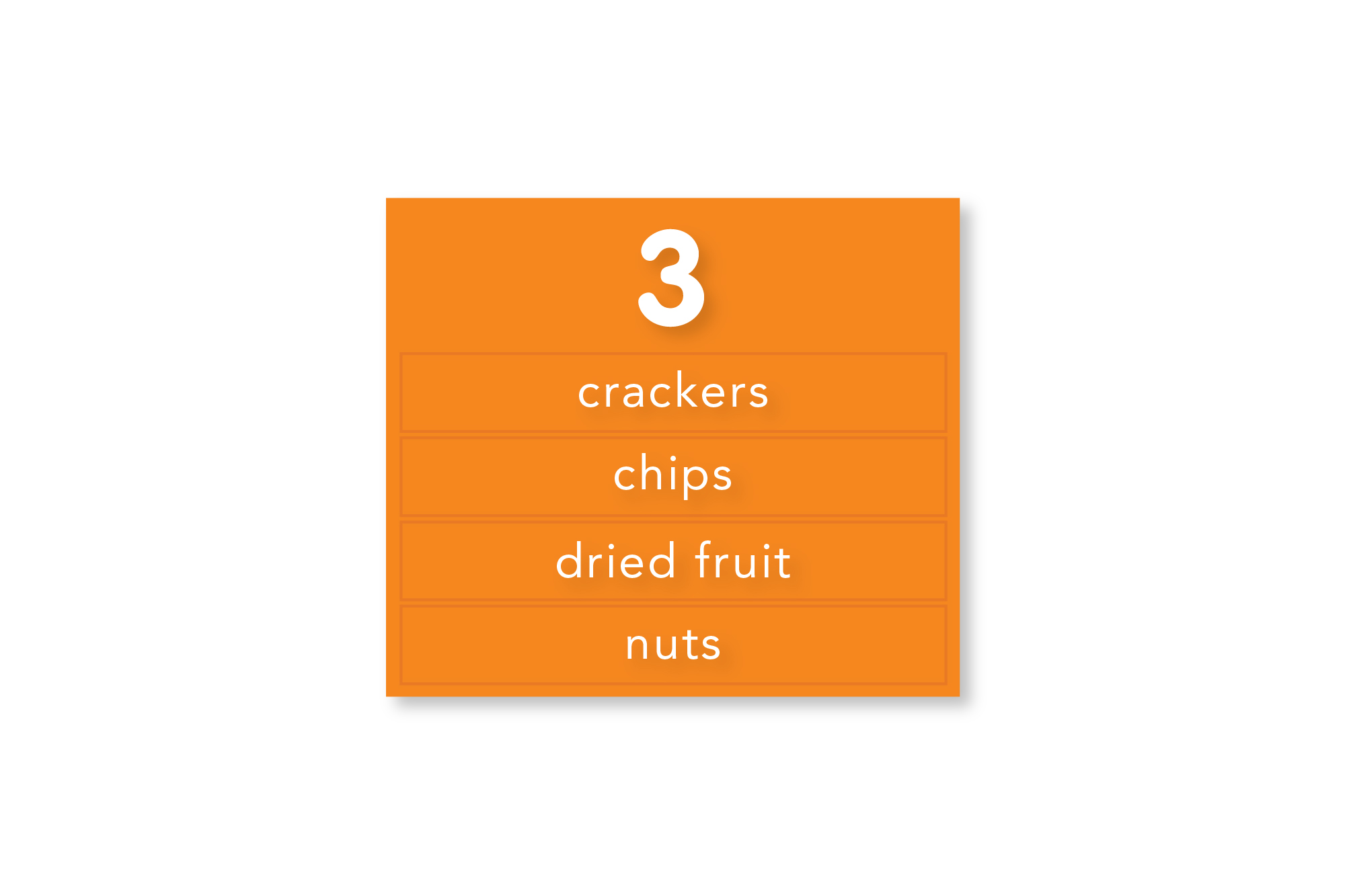
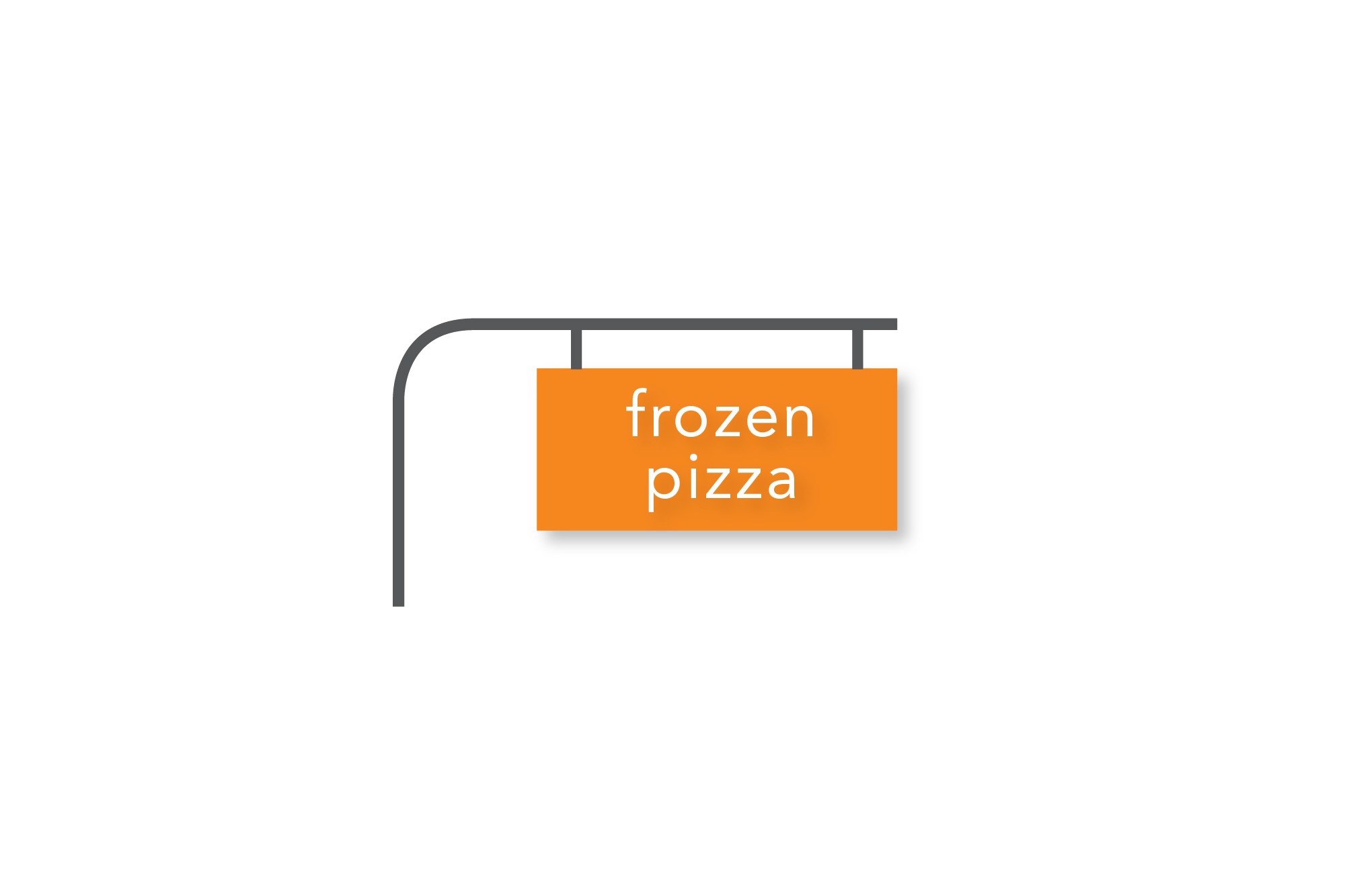
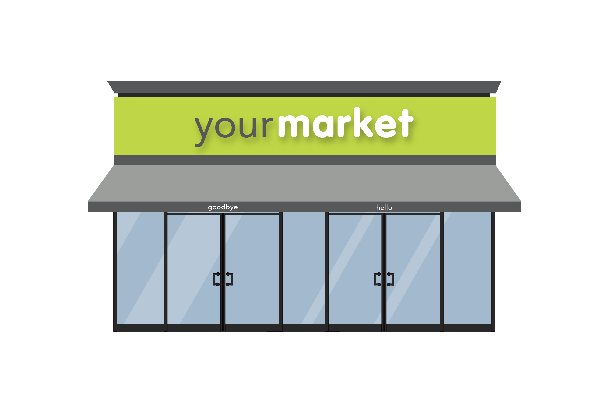
Interchangeable, relevant, aisle signage was created for the store interior with maximum appeal and usability in mind. The updated logo and brand is also continued on the exterior of the store with friendly “hellos” and “goodbyes,” which further intrigue viewers and encourage business.
The updated brand is friendly and inviting, welcoming customer’s of all ages while still encompassing the store’s ideals. The typographic solutions are now modern and versatile, ensuring their timelessness and practicality. These simple, yet profound, adjustments bring the much needed and desired new identity and life to the old store.
your market – logo
your market – symbol
your market – logos alt
your market – aisle signage
your market – signage
your market – exterior
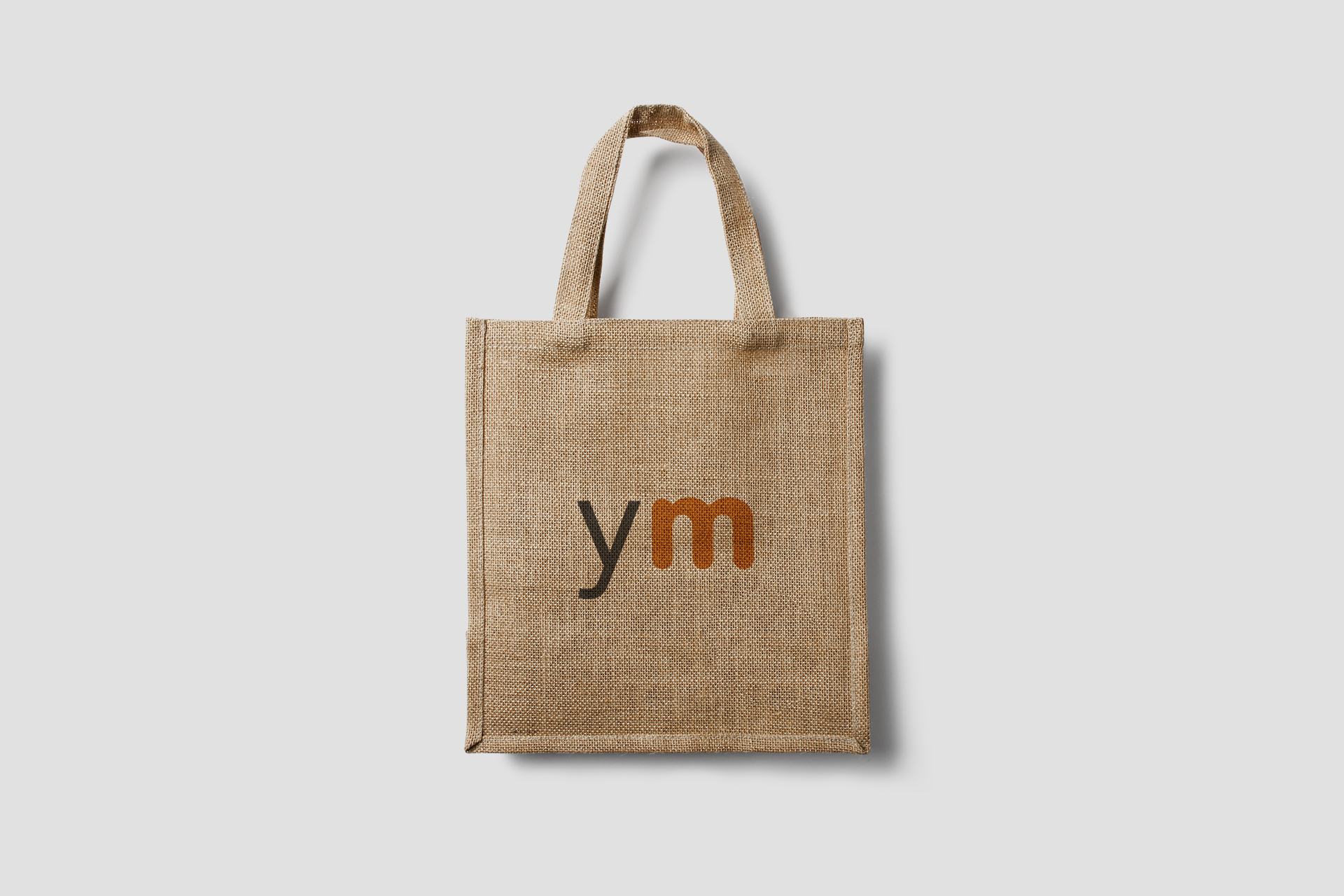
your market – bag
