Author: sholley
Free-Lensing Photography
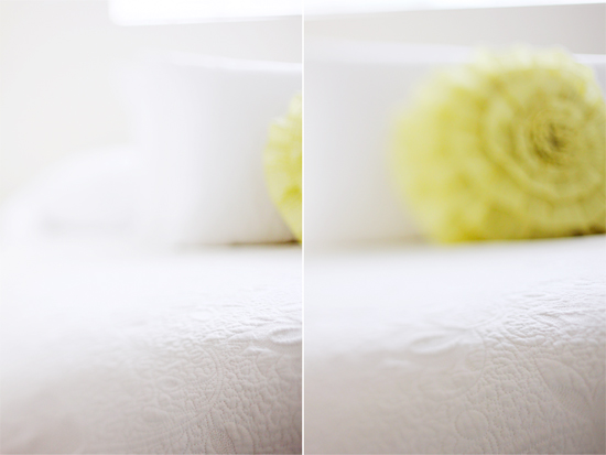
Free-lensing is a fun technique to try if you have a camera with a removable lens. It’s a method of shooting with your lens detached from the camera – but held very closely. Holding your lens up to the camera (instead of attaching it) allows you to create a tilt-shift effect in your photos. With a lot of practice, you can even learn how to selectively focus on one thing, while everything else becomes blurred.
But don’t be discouraged if you feel like nothing is focusing how you would like at first. It really does take a lot of practice. Practice photographing objects around your house before you try this on people – it’s much harder to focus when your subject is a moving object. For more inspiration and examples, read more about “free-lensing” here.
Tips for Trying it Yourself
1. Select your lens. Free-lensing isn’t as effective with a wide-angle lens, because it’s much harder to get anything in focus. If you have several lenses to choose from, start with a 50mm or higher. If you have a zoom lens that came with your camera, you might want to make sure the lens is zoomed in to at least a 50mm range, if possible.
2. Before you detach your lens from your camera, set your exposure. Auto-exposure won’t work correctly if your lens isn’t connected to your camera.
3. Take off your lens, hold it very closely to your camera, and move it around a little. You get some really beautiful effects the more angles you try to hold it at. For instance, if the left side of your lens is touching your camera still, angle it so that the right side of your lens is pulled away from the camera. Try taking a few photos, and see how you like them! It’s pretty exciting, right? (Note: Nikon users will need to set their camera to manual mode before removing the lens)
4. Practice! Practice, practice, I can not overemphasize this! This might not be something you will pick up right away, but if you love the effect, then it’s definitely worth the time to shoot 100 photos before you like one.
5. Set the focus ring to “infinity” before you take your lens off.
Photo credit to eat.sleep.cuddle.
Basic Photo Editing on your iPhone
I previously wrote a post about how to take better photos on your phone about the tips & tricks I’ve learned for getting the most out of my camera app. Today’s post is all about editing those photos. That means moving beyond the point and click and into the exciting world of editing and beyond! And the best part is: you can do this all on your phone! With the help of a few adjustments and apps you can make your photos really pop.
Adjustments
My primary goal when taking photos is to capture the best picture I can using the photo tips I’ve learned so that I can keep editing to a minimum. If a photo is poor to begin with often times no amount of editing can save it. With that said, I usually only ever adjust three settings: brightness, contrast, and saturation. That’s it. I find adjusting any more than that can quickly make the photo look “fake” or, frankly, edited. [Gasp!] The goal is to bring out the natural beauty of the photograph, not change it completely.
Filters & Apps
My absolute favorite photo editing app is VSCO. It offers some of the best filters (mostly free), customizable adjustments, and user-friendliness around. I don’t always apply filters to my photos, but if I do its typically N1 or N3 from the VSCO app (the photo at the top of this post uses the N3 filter). And I always apply them lightly. I like to keep the filter’s opacity at 40% or below. Other photo apps I like are Snapseed for blur effects like tilt-shifts, and A Beautiful Mess for fun add-ons like text or borders.
Cropping
Lastly, but still important, is the art of photo cropping. The tip that always stuck with me is to avoid chopping off limbs (i.e. hands and feet) if at all possible. If you must crop out either, do it at just above or below the elbow or knee. Never at awkward places like the wrist or ankle. Again, this is just a guideline and I’ve definitely chopped off hands and feet before, but following this rule of thumb helps the photo feel more professional and less amateur.
—
Do you have any tips for editing photos on your phone? I’d love to hear them in the comment section below!
Pure CSS Custom Error Messaging for Default Form Elements
This tutorial will show you how to create and customize error messaging for various form elements. In this tutorial, we will customize everything from a basic error message to input field errors and tooltips. The best part? We will be using only CSS for customizations – that means no images or javascript required!
HTML
Below is the markup for the form elements we will be creating error messaging for. This is all of the HTML used throughout this tutorial. Copy and paste this code into your working file:
<!-- Basic Error Message -->
<div class="error-message">
  <span class="error-text">Checkout could not be completed. Please check your login information and try again.</span>
</div>

<!-- Input Field Error -->
<div class="input-group error">
  <label>Password *</label>
  <input type="text">
  <div class="error-message">Password is a required field.</div>
</div>

<!-- Input Field Error with Tooltip -->
<div class="input-group error">
  <label>Quantity</label>
  <input type="text">
  <div class="error-tip">Enter a quantity</div>
</div>
CSS
Now onto my personal favorite: the CSS. We will keep the basic functionality of the form elements but completely customize their appearance. In the end, they will stand on their own as custom design elements that thoughtfully guide the user through the form process, making it as straightforward and painless as possible.
Basic Error Message
Let’s start with a basic error message. We are going to customize the HTML above to look like this:
This is what we start out with, by default, after adding the HTML:
Customizing a basic error message is really simple. All we have to do is give our text a colored background and a couple font styles using CSS. To style the error message background, add the following styles to your CSS stylesheet:
.error-message {
  background-color: #fce4e4;
  border: 1px solid #fcc2c3;
  float: left;
  padding: 20px 30px;
}
Now let’s style the text itself by adding the following font styles:
.error-text {
  color: #cc0033;
  font-family: Helvetica, Arial, sans-serif;
  font-size: 13px;
  font-weight: bold;
  line-height: 20px;
  text-shadow: 1px 1px rgba(250,250,250,.3);
}
That’s it! Keep reading to learn how to style input field and tooltip errors.


